
Kelvin Emtech
Kelvin Emtech is a Montréal-based engineering consulting firm that designs reliable electromechanical systems for critical facilities. Its expertise helps organizations build infrastructures that are resilient, efficient, and prepared for the unexpected.
Team
CHILICLUB
My role
UX/UI
year
2025
programmes


Starting with what was broken
After thorough analysis of the current site’s workflow, we realised the information provided was scattered, incomplete, and beyond reach to the general public. Therefore, it led to the loss of potential clients who did not have any expertise in this field.
The priority was to reorganise the old content and harmonise it with the upcoming one.
main issue
Incomplete and scattered information
Services, projects, and expertise lived in different places with no connecting thread. A visitor couldn’t build a complete picture of what Kelvin Emtech actually did — even if they stayed long enough to try.
side problem
Copy that assumed expertise
Content was written for engineers, not for the procurement leads and facility managers who initiate contact. Non-specialists bounced before they could understand the value.
other problem
The navigation had no logic
Five pages with no clear priorities: the confidential policy sat at the same level as the homepage. The hierarchy told the user nothing about where to go or what mattered.
Stepping back before moving forward
Before taking any design decisions, we fixed how the content was organised. The visual problems were downstream of a structural one, so it was necessary to deal with the root cause before anything else.
We mapped every page, every content block, every navigation path. Simultaneously, we analysed competitors to identify where Kelvin Emtech could differentiate visually and editorially — not just catch up, but stand apart.
We rebuilt the content hierarchy from scratch — deciding what information belonged at each level, how pages related to each other, and what a visitor needed to know at each step of their journey through the site.
The nav became the first proof point of the new structure. We proposed a three-level system that was both functional and informative — giving visitors orientation from the moment they arrived.
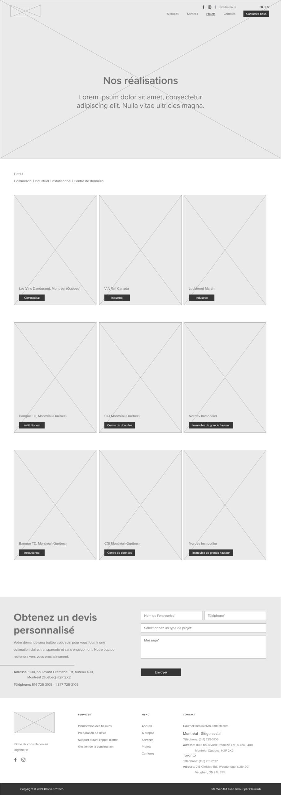
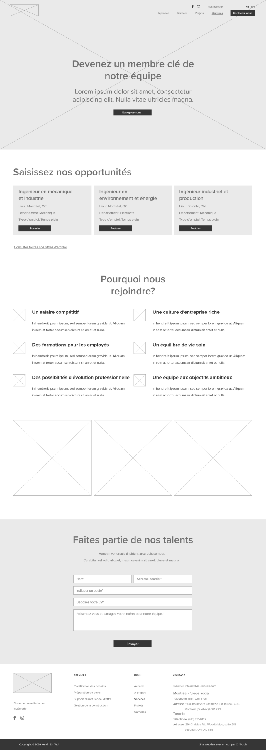
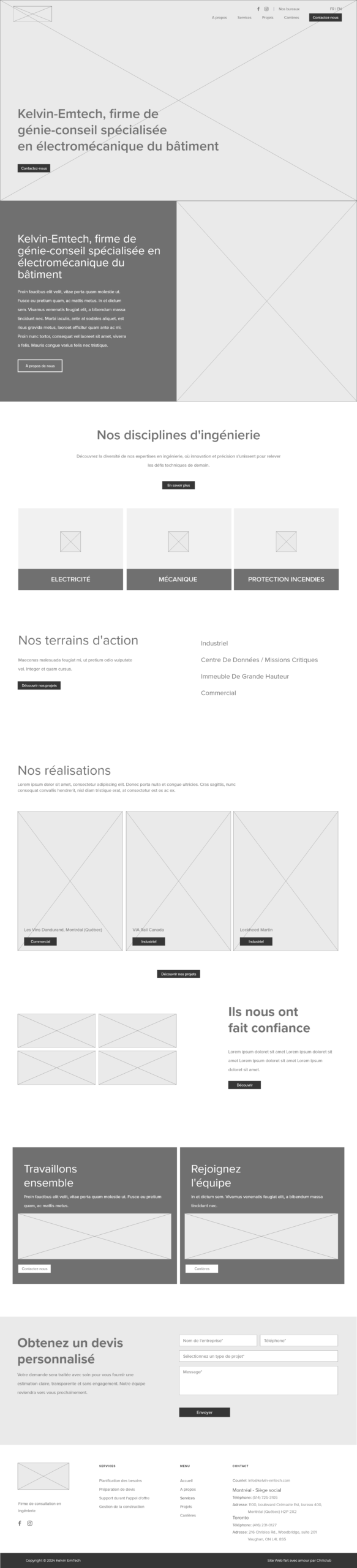
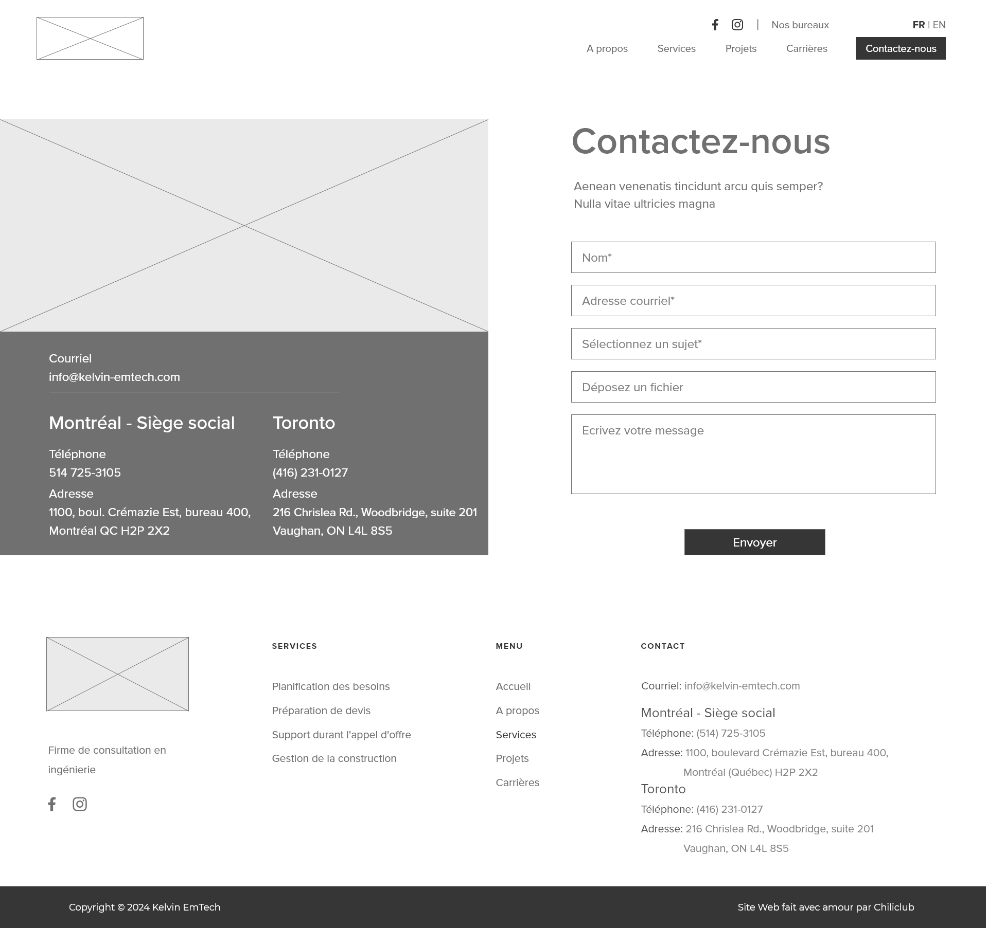
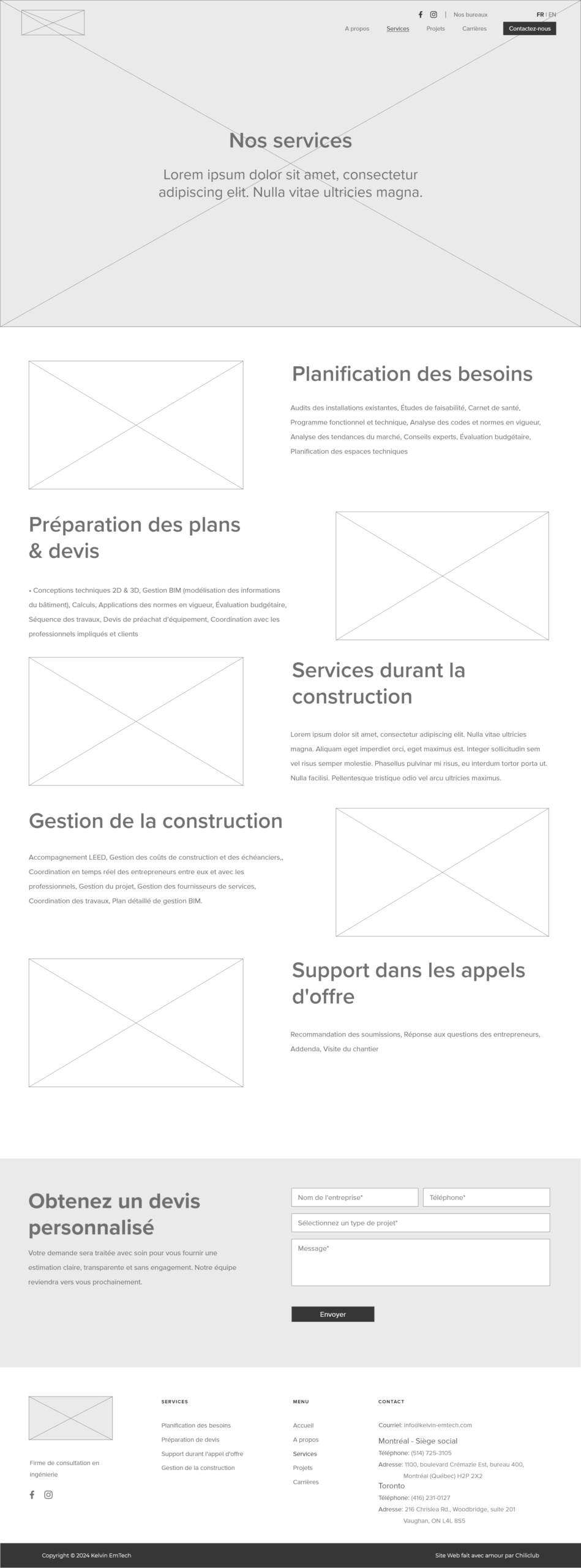
I built plain wireframes for every main page — Home, Services, Projects, Careers, Contact. The goal was to assess content organisation and identify resource requirements before committing to any visual direction.
With the structure validated, we developed a new visual identity — a palette that balanced the authority of a technical firm with the approachability needed to convert non-specialist visitors. Typography and colour were chosen to do the heavy lifting.
Three levels,
one clear path.
In the original navigation, the hierarchy had not been defined: every page sat at the same level, with no guidance. We replaced it with a three-level structure that informs and orientates the visitor before they even click anything.
- Level 1 - Company identity: name, logo, and brand positioning. Who we are before anything else.
- Level 2 - Location + contact + social links: Contextualises the firm immediately for local visitors.
- Level 3 - Site content: Six clear destinations in priority order.


Testing the structure first
I built wireframes in a deliberately stripped-down style — no colours, no imagery, no visual noise. The goal was to make content organisation legible, identify gaps, and align with the client on what needed to be written or updated before any design work began.
A visual system
anyone can follow
The challenge was to design a visual system that felt credible to engineers and accessible to everyone else. The palette does this by pairing the authority of deep navy with the warmth of aviation blue and the energy of dragon fire orange — a combination that signals precision without intimidation.